
Eye on Packaging: Four Trends That Defined Spring Fair 2026
Spring Fair 2026 is one of the retail calendar's most significant showcasing events. Major multiples, independent retailers, and buyers from across the sector headed to the NEC Birmingham this week to soak up the usual mix of inspiring products, masterclasses, and networking opportunities.
But we weren't there just to admire the vast array of products. Our mission? To decode the packaging trends on show.
Trend 01: The Enduring Appeal of Minimalist Kraft
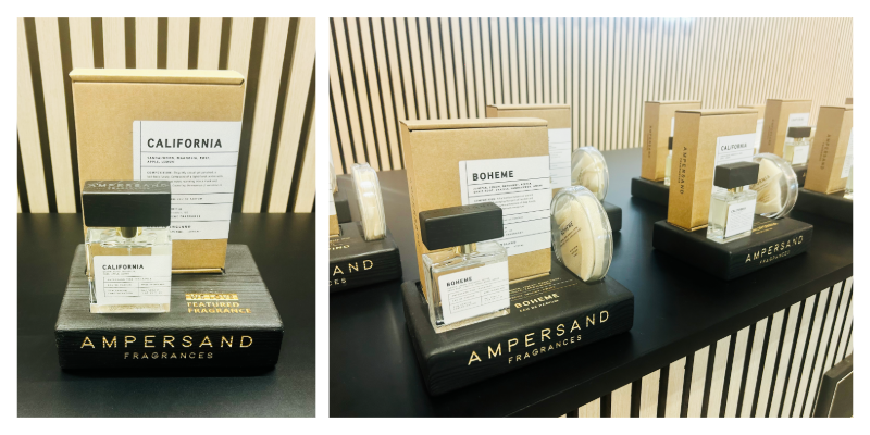
If you thought minimalist brown packaging had run its course, think again. The aesthetic popularised by brands like Aesop remains a go-to formula for those seeking an elevated, premium-mainstream positioning.
Ampersand Fragrances demonstrated this approach perfectly. Their clean kraft boxes with simple typographic labelling and subtle product information embodied the "less is more" philosophy that continues to resonate in the scent category, from candles to perfumes.
Why does this work? The minimalist kraft aesthetic signals authenticity and understated reassurance. It allows the product to be the hero while the packaging plays a supporting role that whispers "considered" and "refined". For brands positioning themselves in the premium-but-accessible space, it remains a safe (but effective) bet. The natural, uncoated substrate also carries subtle environmental credentials, even when sustainability isn't the primary brand message.
Trend 02: Colour Coordination as Visual Strategy
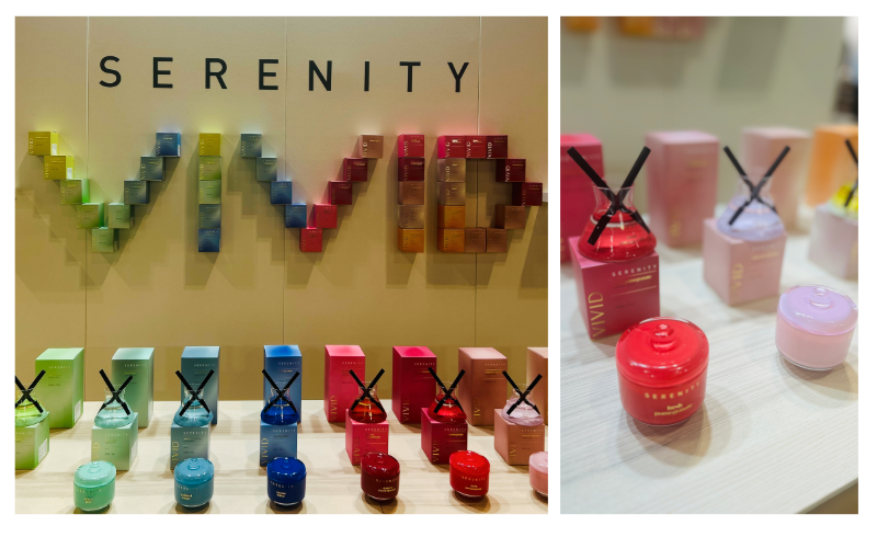
Home Fragrance Co's Serenity range demonstrated a masterclass in using packaging as both wayfinding tool and visual spectacle. Their bold, saturated colour palette organised products into distinct families while creating a powerful merchandising moment that's impossible to ignore.
By coordinating packaging colours with fragrance profiles or product variants, Serenity achieves two objectives: it helps shoppers navigate the range intuitively, and creates a striking visual statement when products are displayed together in-store.
This technique borrows from visual merchandising principles, where repetition and colour blocking drive impact. When executed well, as Serenity has done, individual packs become building blocks of a larger brand canvas. The result? A range that demands attention and simplifies decision-making simultaneously.
Trend 03: Sustainability Signals Through Material and Tone
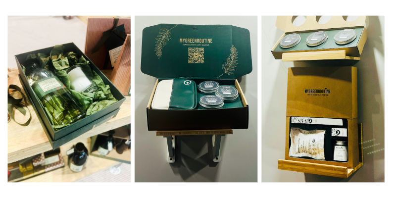
Unsurprisingly, sustainable brands were out in force, and their packaging reflected their values through both material choice and aesthetic decisions. The dominant look? Muted, earthy tones combined with natural cardboard substrates.
The Kitchen Garden Collection by family-run business Fikkerts showcased how green tissue paper and natural kraft materials could create an instantly recognisable sustainable brand identity. Meanwhile, MyGreenRoutine took a more sophisticated approach, using print overlays on their dark green packaging with clever die-cut windows to hold products securely while maintaining full visibility.
The genius of My Green Routine's execution lies in its dual function: the structural die-cuts serve a practical purpose (product retention and protection) while simultaneously creating a design feature that elevates the unboxing experience. The dark green base with gold printing adds premium appeal without compromising the sustainable positioning—proving that eco-friendly doesn't have to mean basic.
Cardboard, in particular, has become packaging shorthand for "sustainable." Whether left natural or printed with earthy tones, corrugated and solid board materials carry inherent environmental credentials in consumers' minds. For brands with sustainability at their core, leaning into these material qualities rather than fighting against them creates authentic, coherent brand expressions.
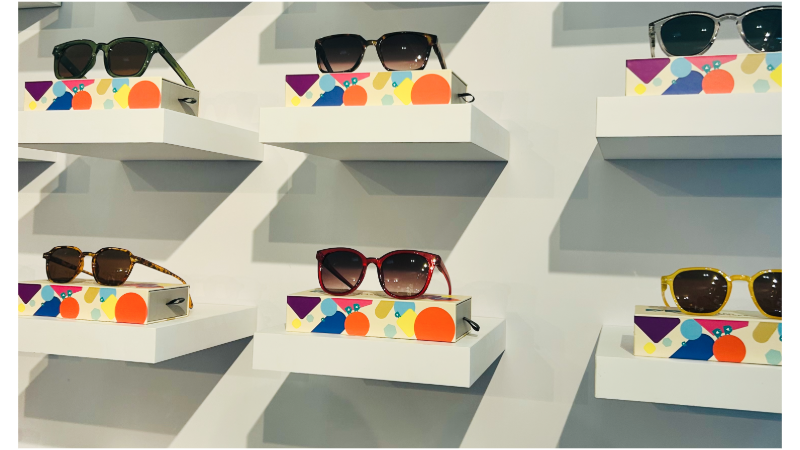
Trend 04: Eyewear Brands Stealing the Show
If there was one category that consistently delivered packaging excellence, it was eyewear.
Two brands, in particular, demonstrated how thoughtful packaging can transform affordable products into covetable purchases.
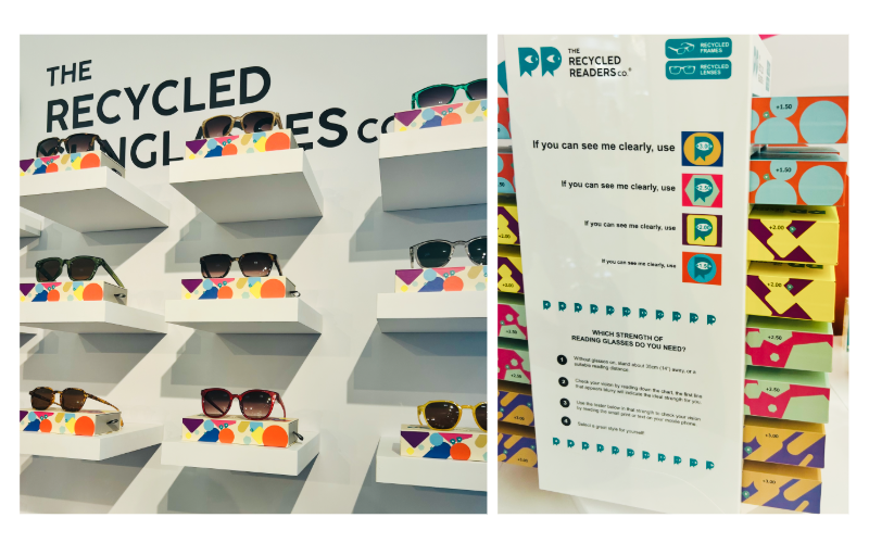
The Recycled Readers Co® proved that a £20 RRP price point doesn't preclude premium packaging. Their vibrant, rainbow-spectrum approach created a bold, playful brand world that perfectly reflected their sustainable credentials (sunglasses made from recycled plastic bottles) while standing out dramatically on their exhibition stand.
But the colour wasn't just decorative. The packaging colours directly corresponded to lens strengths across their reading glasses range, making product selection intuitive while creating powerful visual impact. It's a perfect example of packaging working harder: aiding the shopping journey while building brand personality and shelf presence.
Powder Design, a Scottish-based accessories brand extending into eyewear, demonstrated a different kind of excellence with their "Exquisitely Bold" tagline brought to life through considered packaging design. Their glasses cases unfold with almost origami-like precision, creating a moment of joy every time you reach for your glasses.
The packaging's structural design is both purposeful and beautifully executed. Thoughtful folds secure the glasses neatly, while the leopard print fabric lining adds a luxurious detail that elevates the everyday act of storing eyewear. This is packaging that enhances the product experience long after purchase, creating ongoing brand touchpoints and reinforcing the premium positioning.
Spring Fair 2026 reinforced a fundamental truth: in an overcrowded retail landscape, packaging isn't just protective—it's strategic.
Whether you're using minimalist restraint to signal premium credibility, colour coordination to aid navigation and create impact, sustainable materials to authenticate your values, or structural innovation to delight customers, packaging remains one of the most powerful tools in a brand's arsenal. Because in retail, the box doesn’t just carry your product. It carries your brand story too.
What packaging trends are you seeing in 2026? Join the conversation in the comments.
Curious about what bespoke packaging could look like for your brand? Reach out to the team here at Leyland Packaging - we'd love to explore it with you.